<!--  -->
-->
One of the basic building blocks of Urbit is Urbit ID, our naming and identity system. Your Urbit ID is a short, recognizable name that’s also a network address for your Urbit OS instance. (You can find a complete, high level description of Urbit ID here.)
Your Urbit ID is meant to feel a bit like a secret code name. It doesn’t leak any information about the real you — but it’s still memorable and recognizable. Getting an Urbit ID should feel exciting, like getting a brand new identity in a new world.
From a design standpoint, some of this is accomplished simply by having a system for the names themselves. Under the hood, Urbit IDs are actually just numbers. There has always been an algorithm for turning these numbers into pronounceable names like ~tacryt-socryp (13,304,832) or ~litzod (1,280) or ~nes (212).
While the names are great, they’re not quite enough, especially in a rich interface. Each Urbit ID really needed some form of visual representation, image, or crest. A digital identity needs to be something you can really attach to, both yours and those that belong to your friends.
There are 2^32^ or 4.2 billion unique Urbit IDs. Clearly there’s no way that we were going to do this by hand. And purely algorithmic solutions can often produce disappointing, undifferentiated output.
Regardless, we set out to tackle this problem. By the end of this process, every Urbit ID got its very own ‘sigil.’
In this post we’ll walk through how we thought about the problem, iterated through possible solutions, and the toolchain we used to arrive at the final result.
Background
What are the basic primitives of a visual language? There aren’t any completely authoritative answers to this question, of course. But we knew that to produce such a large number of visually distinct items we’d need some way to reason about form that’s closer to letterforms.
So we started by collecting influences.
The ‘chop’ or seal is conceptually pretty close to what we wanted to get to.
<br /><br />
Kamon are even closer — especially since they have very little visual complexity.
<br /><br />
We also spent a good amount of time with both Anni Albers and Agnes Martin. Both of these painters had an incredible mastery of the grid as a means of creating engaging visual work. These paintings all have a wonderful tension between an underlying system and their specific expression.
<br /><br />
Frank Stella is a master at producing incredibly dynamic work from only a few elements. His ability to create a sense of depth from simple overlapping elements is fantastic.
<br /><br />
The plans of both Ledoux and Palladio are incredibly dynamic. They’re mostly gridded, use only a few elements, and use lots of symmetry — but they’re at once distinct, engaging, and fresh.
<br /><br />
Another influence: international maritime signal flags. We like these not only because of their striking visual qualities, but also because they correspond with a letter system, just like our sigils. Each one conveys useful information; for example, “Keep clear of me; I am maneuvering with difficulty,” a flag we all feel like raising from time to time. This influence was key to the idea that pairing symbol to phoneme was a possibility.
You can see the whole collection of our visual research here.
Ultimately, we didn’t specifically draw on any of these influences very consciously. The goal of visual research is to get a sense of the territory, what has been tried, and what works. We think these threads of prior work are evident in the final result — you can feel them, but it’s tough to point to them individually.
What’s in a name?
“Lev’s sigil appeared, strobing, as Netherton was getting out of the cab in Henrietta Street. “Yes?” Netherton asked.”
— William Gibson, The Peripheral
Before we get to how we worked through the problem of actually designing these things, let’s talk about the problem of naming.
We went through so many names for these things. Crest, symbol, seal, tag, pictograph, stamp, emblem, signet, icon, glyph, holomark, visage, radigy, pattern, the list goes on for an incredibly (embarrassingly) long time. We argued about this, we went back and forth about it.
Sigil won, ultimately, because of the way that it’s personified in William Gibson’s The Peripheral. In the far future, characters talk to each other by some kind of telepresence. When a call comes in from someone else, they first appear as a ‘sigil.’ It’s a strange word, but we were imagining a similar use-case.
While we can’t point to any specific parts of our visual research that reappear directly, sigil is lovingly borrowed.
Experiments + iterations
So, how did we actually end up making these things?
We iterated through plenty of possibilities before landing on our final approach. Let’s walk through the two we remember best.
<br /><br />
The first attempt was a series of images in the style of Karel Martens. Overall this technique was just too cluttered and sometimes difficult to parameterize in a predictable way. We kept iterating.
<br /><br />
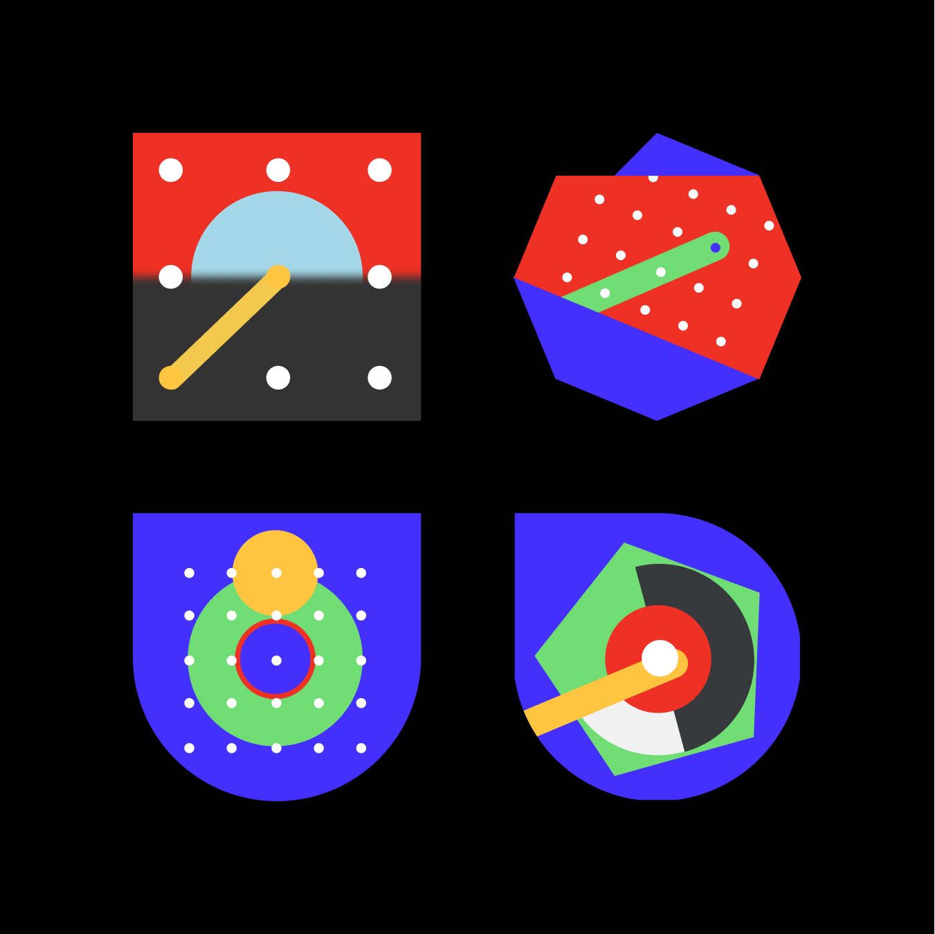
Just like the previous example, the main idea was that we could take a set of geometric primitives, combine them, then alter their appearance along a set of parameters, like color, rotation, and size.
But also just like the previous attempt, the technique of overlapping symbols made the images too difficult to read and differentiate. We wanted to create sigils that were not only great to look at, but visually ordered. Since overlapping elements didn’t seem to quite hit the mark, on we went.
Closing in
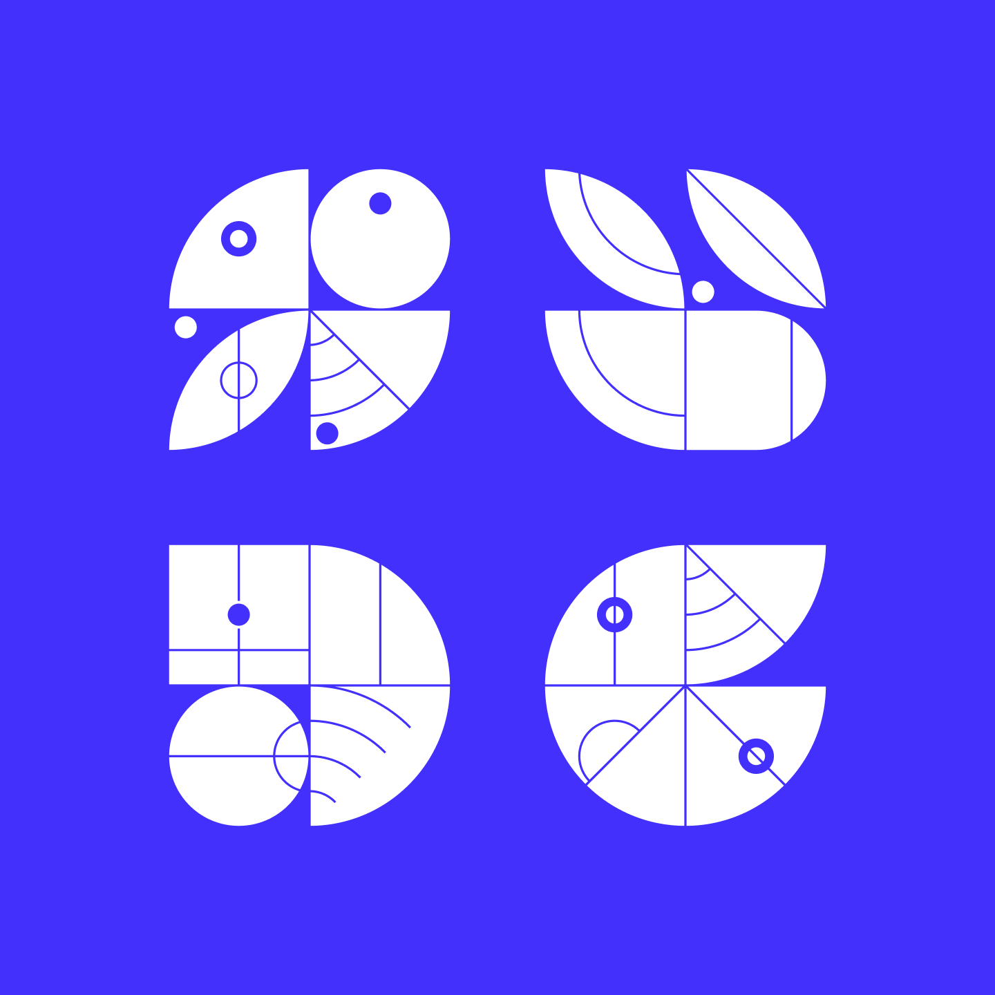
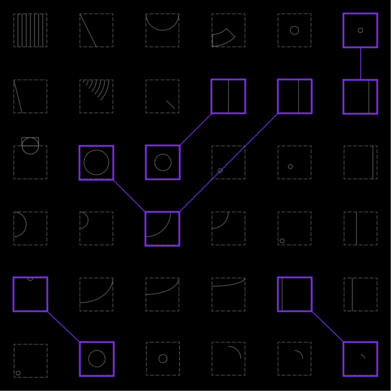
Eventually, we realized: tiles! With tile designs there are no overlaps, which in early experiments immediately started to take on the consistent, legible appearance we were after. Each element is discrete and clearly visible. Tile designs were also easier to create and control from an implementation standpoint.
Best of all, tiles made it clear that we should be thinking in terms of creating representations of individual syllables rather than entire names. Urbit IDs are constructed from two sets of 256 three-letter syllables. ~fallyn-balfus is fal lyn bal fus, for example. (There are two syllable sets in order to prevent duplicates — we always alternate between the two when composing names.)
Thinking in terms of syllables greatly reduced the complexity of the problem, but there was still some work to do.
<br /><br />
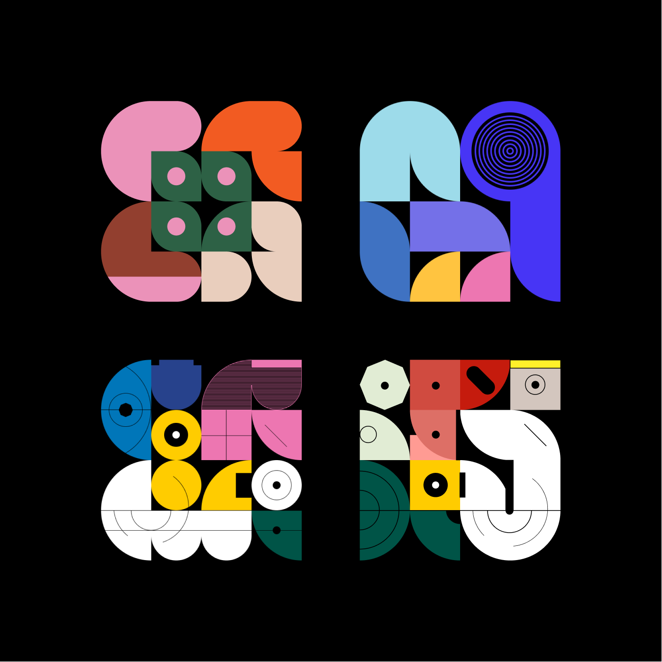
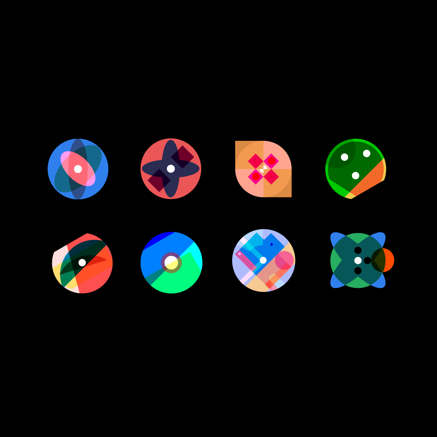
At first, we thought about using a 4 x 4 tile grid, as shown here. These designs were tricky to implement because of the detailed lines and arcs spanning across individual tiles. In order to generate a result that matched these mockups, a program would have to generate a data model that knew about which tiles touched which other tiles.
We felt this was too complicated and had an unknown performance profile. Plus, they proposed a deterministic color scheme and we felt strongly that color is personal, not to mention hard to parameterize. In the end we thought it better to create something that had the potential for user customization.
<br /><br />
Around this stage, we were thinking a lot about how architectural plans aren’t unduly constrained by the fact that they’re only one color. We had a feeling we could make the grid smaller and assign details to the tiles individually.
<br /><br />
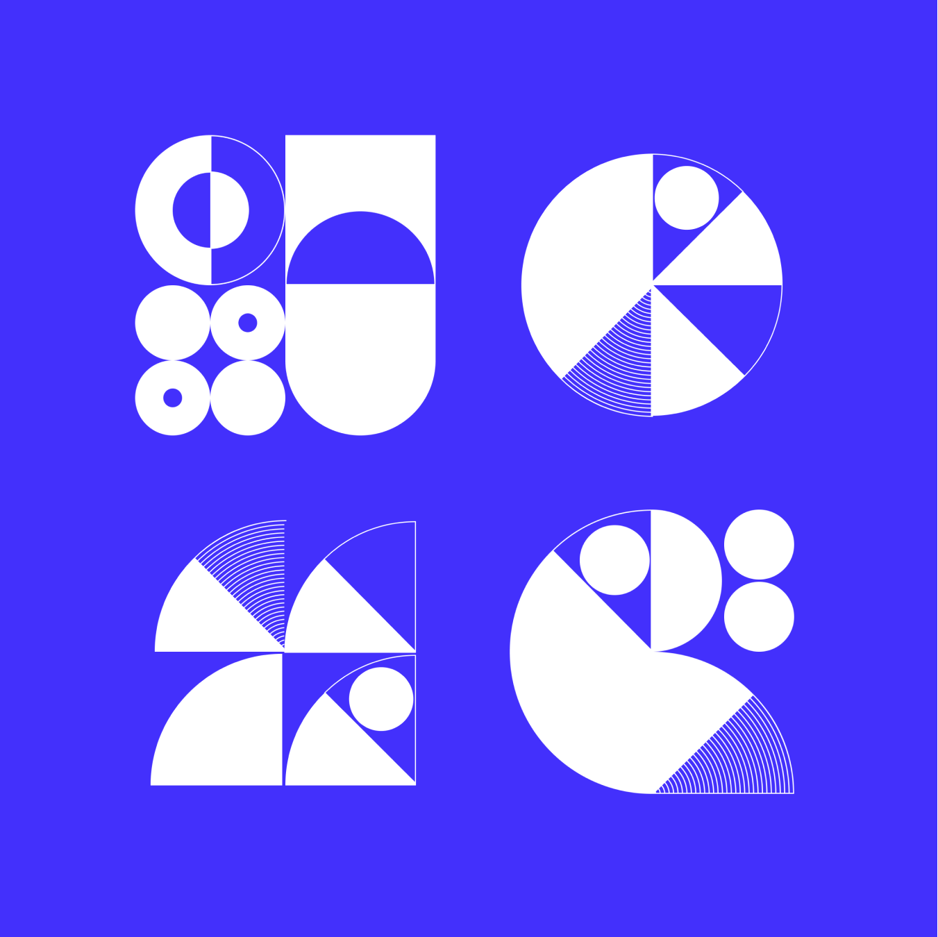
So, we scaled it down to a 2 x 2 grid and stuck with it. It’s simple to implement, visually unique, consistent, and the color scheme is black and white, leaving room for user customization. We felt we had reached a semblance of a final result. Now all we had to do was manually draw 512 unique but consistent individual ‘phonemes’.
<br /><br />
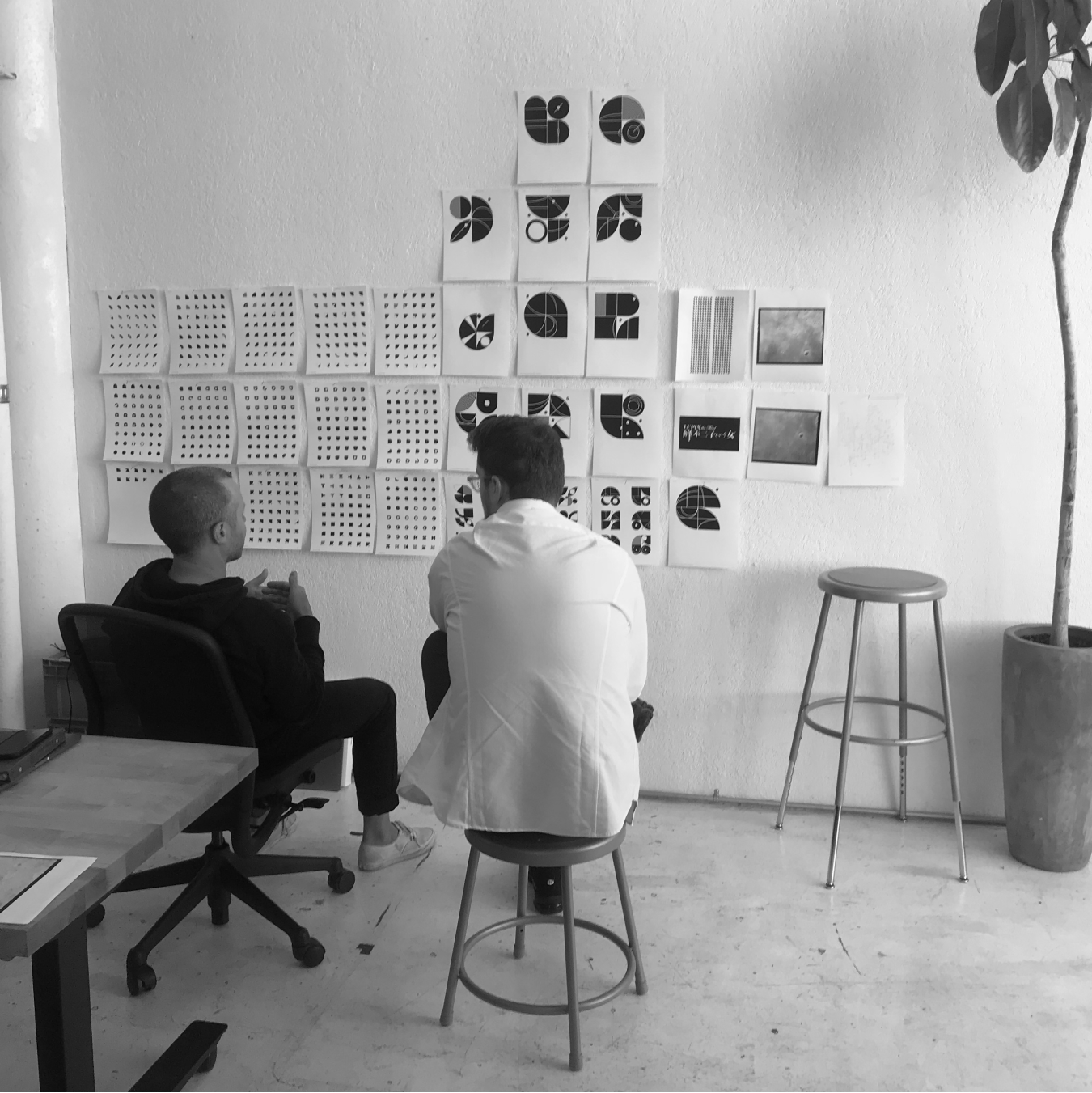
As it turns out, drawing 512 consistent, abstract elements by hand isn’t easy. We had to strike a balance between authorship and automation — we wanted each tile to look well-made, but not too authored. To do so, we took advantage of Figma’s web API which helped us design in SVG but iterate programmatically.
Final process
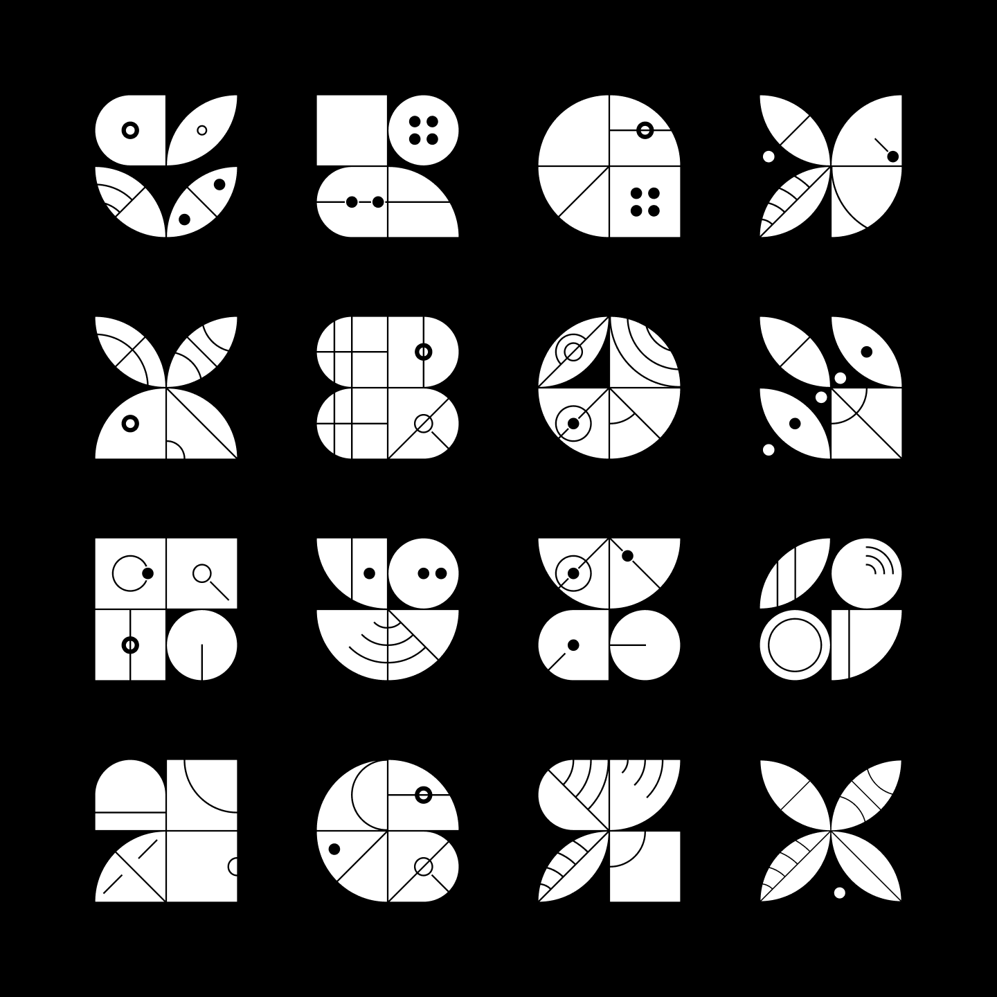
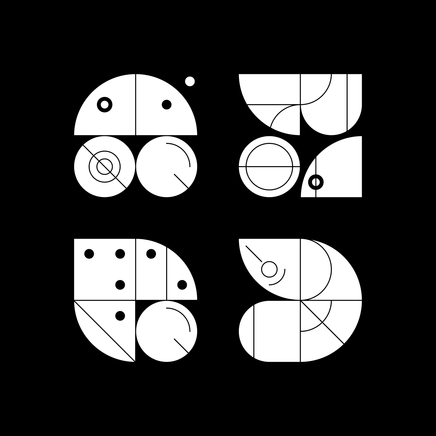
We took a look at our hand drawn mockups and drew each individual visual building block of the tiles separately. Then we loaded the SVG elements into a script that programmatically combined them to create trillions of layered symbols. This way, we were able to easily select candidate phoneme symbols that worked visually.
We eventually added a rule system to find higher quality phoneme symbols — but this combination of programmatic generation and hand selection was working pretty well.
<br /><br />
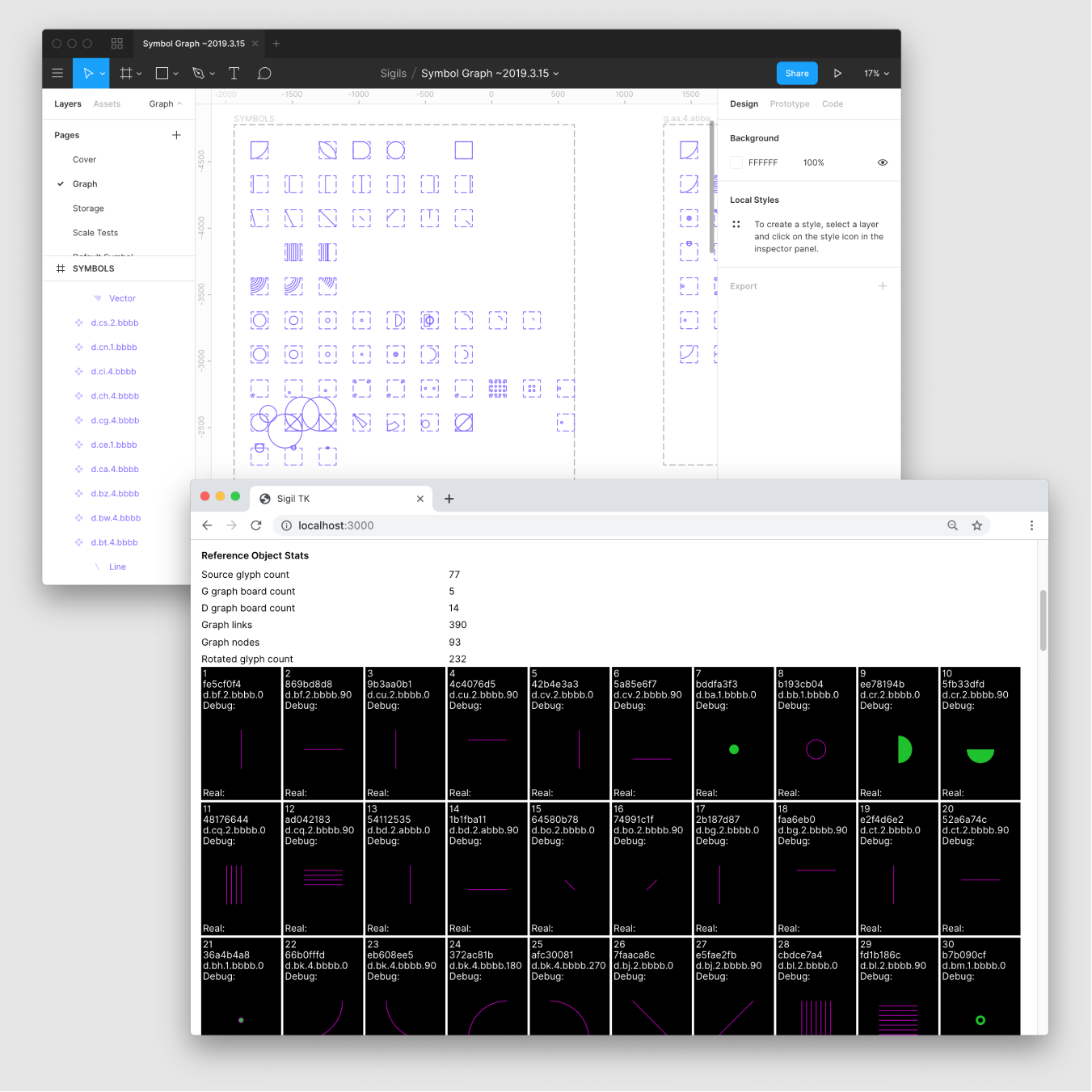
The final step, using the tool we built, was to hand select individual phoneme symbols and create a complete index.
<br /><br />
This allowed us to start looking at possible combinations and selecting phoneme symbols based on their interplay with others.
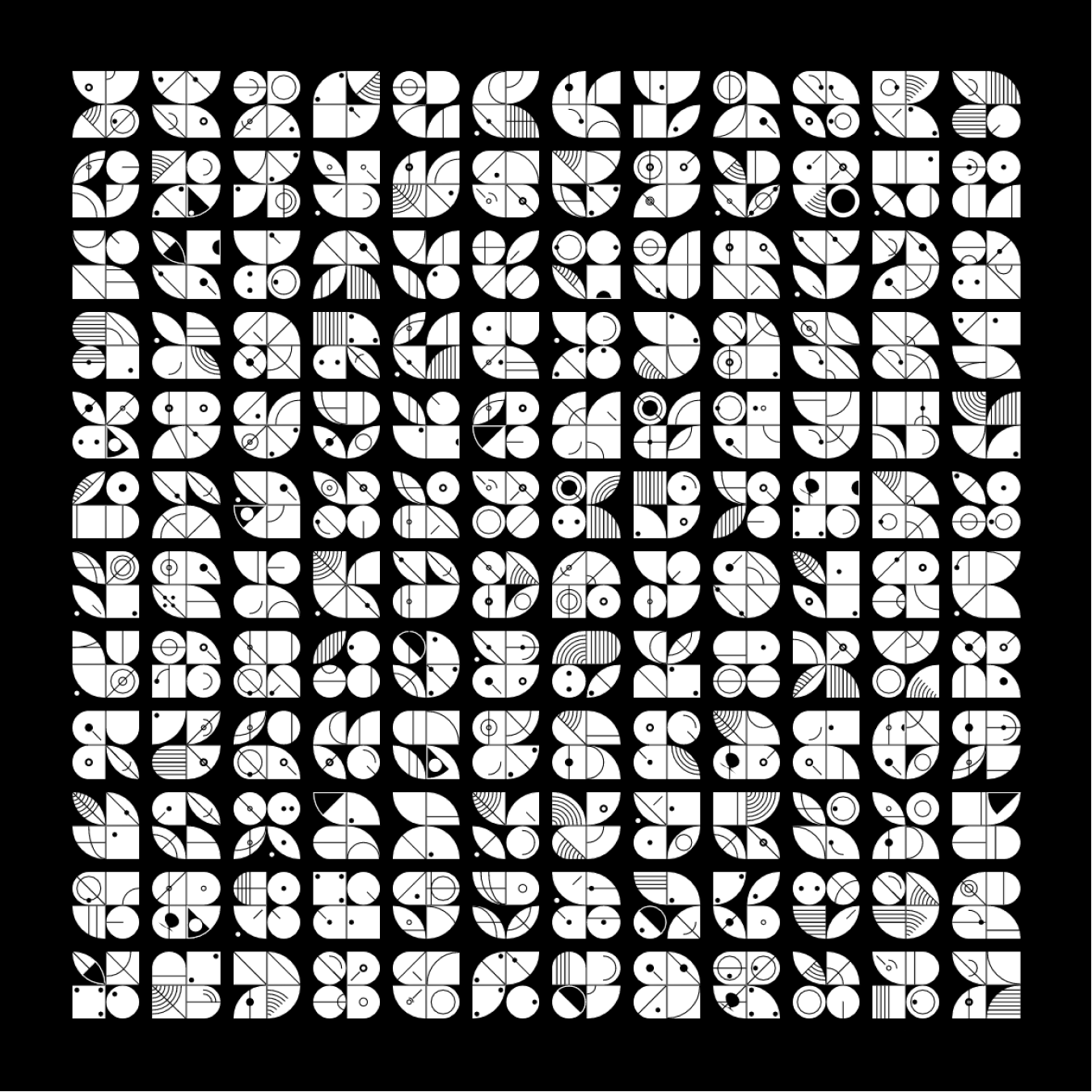
Once we had selected the final set, we went about compiling the sigil-js library that’s now publicly available. This turned out to be fairly technically complex due to the different ways SVG is handled between browsers and Figma — but the end result is a single Javascript library you can use to embed an SVG in almost any context on a web page. See it in action and browse the available sigils here. If you're technically inclined, the source can be found on GitHub.
<br /><br />
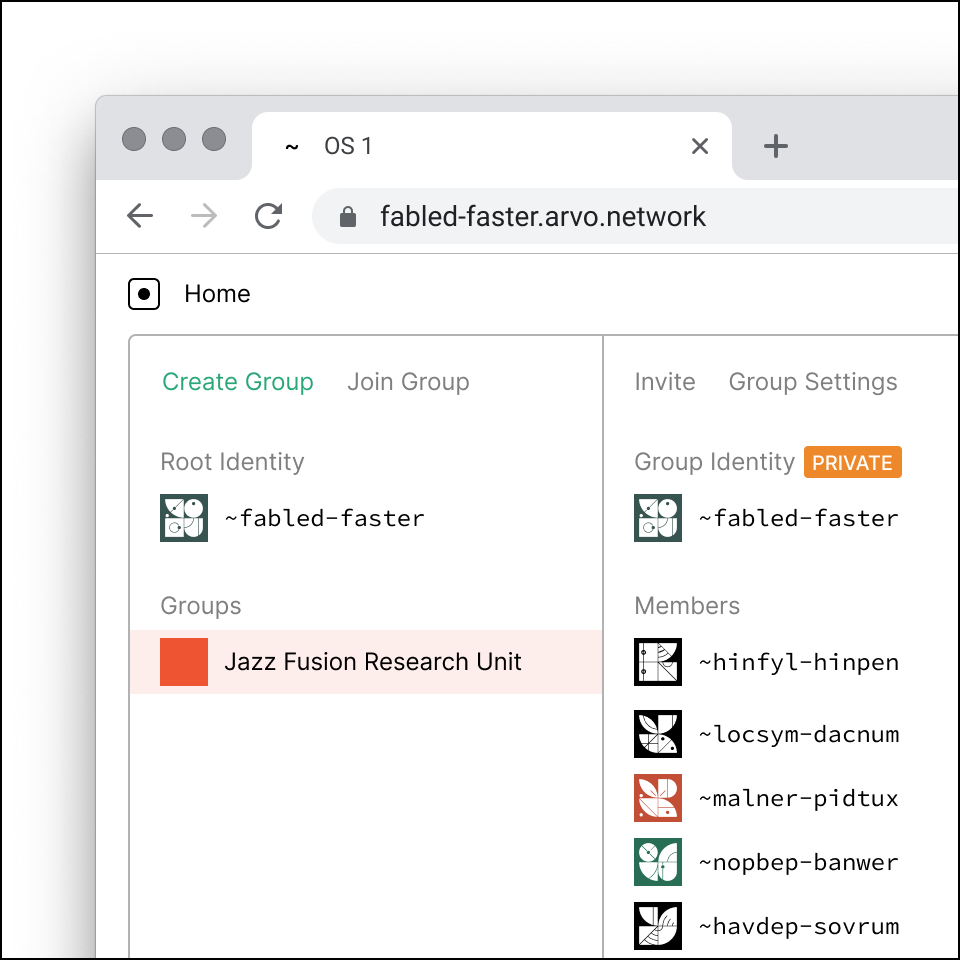
We think sigils are pretty successful. They look nice in our native Urbit interfaces, people have made them into shirts and posters and cards, even laser-cut them to make stamps.
Urbit ID and the sigils are components of Urbit that are totally separate from the OS — you can use them on their own and potentially even extend their functionality. We’re happy with what we’ve done with them so far, and hope that people will experiment with what’s possible with this naming and identity system.